Since 2001 our developer community has impacted tens of thousands of small businesses through their integrations with QuickBooks Online.
At Intuit we use design thinking to deeply understand our customers and solve their problems through our design principles: Design 4 Delight and Customer Driven Innovation. These simple principles that help us solve customer problems in delightful ways are equally accessible to you.
In order to help developers continue their success and offer integrations that customers love, we’ve created a list of ways that will continue to delight those who use your current products or ones you plan to build.
The list was developed in collaboration with one of our partners, Webgility, as we explored new updates to the sign-up flow for their application,Unify, that syncs e-commerce data from marketplaces such as Amazon, Etsy, and Shopify into QuickBooks. After several feedback sessions with customers, and great discussions with the Webgility team, we came away with a few main points that we want to share with developer community:
Get out of the office and talk with customers!
This is the most important thing you can do as developers. It ensures you are designing solutions for the most pressing problems our customers face while running their businesses.
Understand the customer to build the right experience
Maybe you have a product and want to improve it or maybe you’re starting from scratch – either way getting in front of customers is vital to your success.
Sitting down with customers to learn how they do business and what could be better about the products they use is a great way to get started. At Intuit, we use a “Follow Me Home” to observe customers using our products in different environments, such as the home, office, or wherever they do business. Asking customers questions as they go throughout their day while they are in their physical and mental work space has been very insightful and allows us to understand them better.
Once the product is ready, designing an easy to understand sign-up flow is next. It’s important to talk with customers at this stage as well. At this point it’s helpful to create mockups and allow potential customers to share their thoughts out loud. Observing where they get stuck or any confusion ensures that you build the right product for customers the first time. At this stage, discovering that a button should be moved is much easier to fix than when it’s in production.
Create a delightful sign-up flow
1. Build the customer’s confidence
The sign-up flow is your customer’s first impression of the product. This is an opportunity to make them feel confident and guarantee that they’ll stick around to use it.
As users go through the sign-up flow, you must manage expectations for what’s ahead of them and the product’s features. Letting the user know what to expect allows them to feel they are in control. Explaining what’s on the page and why the steps are there is a great way to present information and gain buy in from the users.
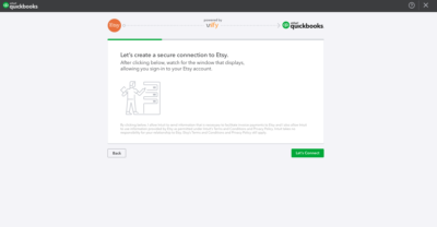
(The introduction page walks the user through what is coming up in the sign-up flow and explains how to create a connection)
Developers also need to balance building a user’s expectations with the way a customer feels. They need to increasingly gain confidence and become excited to use the product. Examples such as an encouraging phrase on each page or a progress bar will help address the issue of customer drop off. You should take advantage of the opportunity to recognize success and tap into a user’s feelings to build rapport. If the user doesn’t make it through the sign-up, then they can’t experience all the great features you built!
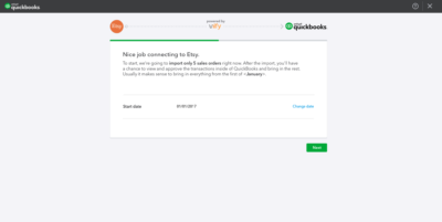
(The connection confirmation page offers an encouragement. Additionally, there is a green progress bar showing that all the user has left is to import data into QuickBooks.)
2. Create the optimal number of sign-up steps
Research shows that the longer the sign-up process for an application or integration, the higher the drop off rate of users. By shortening the steps to what’s essential, you can ensure that more customers will make it to the end and start using your product.
However, be cautious about defaulting all the settings or making the steps too short. For example, QuickBooks accommodates the needs of both small businesses and accountants. In this case, there has to be enough settings customization that gives the user control and shows we understand their needs.
Besides talking with customers, another way to determine the optimal number of sign-up steps is though funnel analysis, which measures how users progress. Tracking the percentage of customers that make it to the next page and where other users drop off can be valuable for addressing concerns within the product.
3. Pre-fill recommended settings to take out the guess work
While providing the ability to customize settings is important for the customer, you can always help by pre-filling recommended settings to make it as easy as possible. This allows there to be enough customization in steps for those who need it, but for those who don’t, it enables the user to quickly accept and move to the next page. In the case of Webgility’s Unify we pre-filled the options with how the majority of users had enabled the way they wanted their data from Etsy to come into QuickBooks.
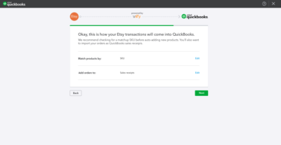
(There are different options for matching products and orders – either by SKU or inventory item name for product and a Sales Receipt or Invoice for orders.)
Another way to ensure that a user does not spend additional time typing out answers in text fields is to use SSO authorization that automatically creates an account. For our partners with integrations like Webgility and their Unify application, customers can quickly sign-up or sign-in using their QuickBooks login information for a seamless experience to create a natural progression for those wishing to use one of those apps.
Understand the end to end experience of a customer’s workflow
While the sign-up flow is an integral part of the product, it’s also important to talk with customers about what they plan to do next. For example, determine the biggest problem the customer wants solved or validated after signing up to show that the product is working. In the case of Unify, we confirmed that customers want to see that their transactional data is flowing into QuickBooks correctly. So, after they were finished with the flow, we landed them on the Sales Transactions page instead of abandoning them on the dashboard.
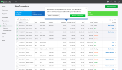
(The Sales Transactions page allows the user to review whether five of the Sales Receipts came in correctly and either import the rest of the transactions or delete the transactions if they did not.)
The above steps summarize our learnings as we worked with Webgility to test versions of the Unify sign-up flow. If you apply them to your own product, you’ll build the customer’s confidence that the product is right for them and ensures they know exactly how to use it. Creating a great sign-up and onboarding experience can give customers a great initial experience that will increase customer satisfaction, conversion, and retention.
Leave a Reply