
Hey Devs,
We’re back again with part 3 of the NodeJS Inventory Tracking Sample App. In this addition, we’ve included a reporting call and displayed it using plot.ly. Built on top of d3.js and stack.gl, plotly.js is a high-level, declarative charting library. Plotly.js ships with 20 chart types, including 3D charts, statistical graphs, and SVG maps.
Much of this post won’t make sense without understanding what happened in Parts 1 and 2, so go check them out and come back here before we continue.
The purpose of Part 3
We understand that the reports APIs are very popular, but its not always clear how they work or how to best utilize the API response. In this blog and example, we aim to help demystify some of the questions you may have.
Adding the Route for
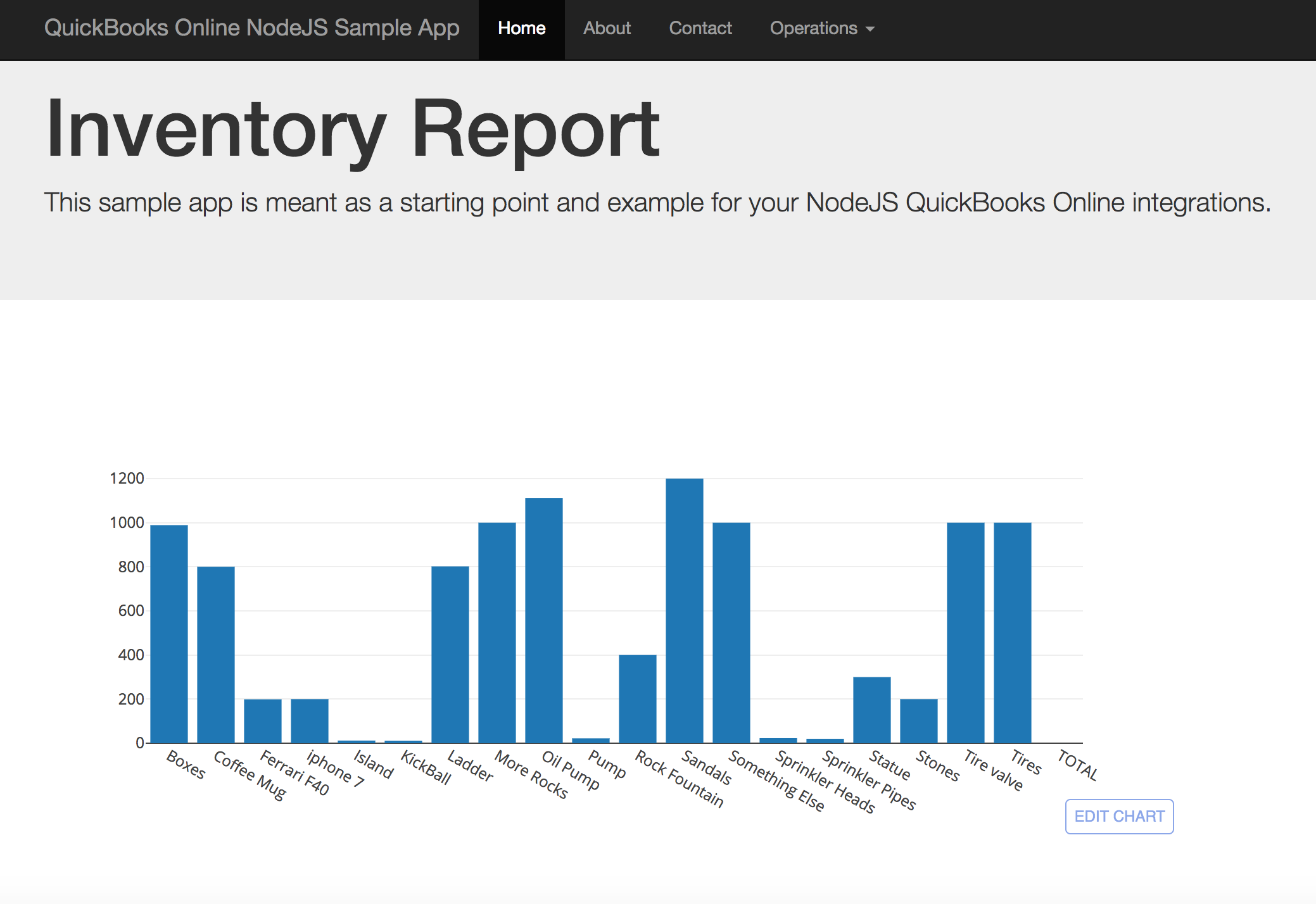
We will be using the Inventory Valuation Summary report to acquire data for the inventory in our company. The following code snippet shows how we call the API and how we pass the data into the plot.ly framework to render the bar chart:
   app.get('/getReport', function (req, res) {
        qbo.reportInventoryValuationSummary(function (err, report) {
            var colData = [];
            var rowData = [];
            var i = 0;
            report.Rows.Row.forEach(function(element) {
                colData[i] = element.ColData[0].value;
                rowData[i] = element.ColData[2].value;
                i++;
            }, this);

            var data = [
                {
                    x: colData,
                    y: rowData,

                    type: "bar"
                }
            ];
            var graphOptions = { filename: "basic-bar", fileopt: "overwrite" };
            plotly.plot(data, graphOptions, function (err, msg) {
                res.render('inventoryChart.ejs', {locals: {charturl: msg.url}});
            });
        })
    })
The response to InventoryValuationSummary report
The response provided by the report comes in two arrays within the Row element of the object:
report.Rows.Row.ColData
The two arrays with data relevant to the report are the first array index [0] and the third [2]:
- The first array index contains the table header information for the ColData[0].value object. For example, in the first column wehave “Boxes”. This is what we’ll use in the table header.
- The third index array contains the value. In the case of this example, ColData[2].value contains “989.0”, the actual inventory level of “Boxes”.
We store these values in the colData and rowData arrays, which are then fed into the plot.ly plot API call as the x and y attributes in the data object. Once we iterate through all of the data in the Inventory Valuation Summary response that we pass to plot.ly in the data object, we will see the following:
Table headers
column Index: Boxes
column Index: Coffee Mug
column Index: Ferrari F40
column Index: iphone 7
column Index: Island
column Index: KickBall
column Index: Ladder
column Index: More Rocks
column Index: Oil Pump
column Index: Pump
column Index: Rock Fountain
column Index: Sandals
column Index: Something Else
column Index: Sprinkler Heads
column Index: Sprinkler Pipes
column Index: Statue
column Index: Stones
column Index: Tire valve
column Index: Tires
Data per Column
column Data: 989.00
column Data: 800.00
column Data: 199.00
column Data: 200.00
column Data: 12.00
column Data: 10.00
column Data: 802.00
column Data: 1000.00
column Data: 1111.00
column Data: 22.00
column Data: 400.00
column Data: 1200.00
column Data: 1000.00
column Data: 23.00
column Data: 20.00
column Data: 300.00
column Data: 200.00
column Data: 1000.00
column Data: 1000.00
The end result once plot.ly performs its magic
A beautiful bar char displaying our data.
Hopefully, this answers some questions that may arise as you begin to consume our reporting APIs.
Happy Coding Devs!
Jimmy Wong
Intuit Developer Evangelist
Leave a Reply